The Moka Theme Overview Hello Moka Theme! Moka is our newest Premium WordPress Theme with a responsive Layout and a beautiful fresh, minimal theme design. The Moka theme highlight is an individual, customizable front page you can use to feature your latest blog posts, a featured post, a big about and quote widget and further…
The Kiore Moana Theme Overview Today we’re happy to present our newest responsive Premium WordPress Blog Theme Kiore Moana to you. Kiore Moana is a great WordPress theme for personal blogs, travel, hobby or photography blogs with a modern, open design, lots of white space, easily readable fonts on all devices and an extra widget…
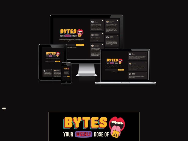
After I read the newest Responsive Design Newsletter by @justinavery this morning I had a little “aha moment”, because I never heard of his awesome side project Am I Responsive? until today. The screenshot tool lets you create helpful screenshot of your responsive website with just one click and it’s also a lot of fun to see your responsive webdesign appear in such a beautiful presentation.
The tool will show your responsive website in a desktop (1600x992px resolution), laptop (1280x802px), tablet (768x1024px) and mobile phone (320x480px) screen and you can even rearrange your setup by draging’n’droping the devices on the screen.
So “Am I Responsive?” is definitely bookmarked, since I think the tool is a beautiful way to create fast responsive website presentation screenshots and to get a first idea how your responsive web design will look on different devices.
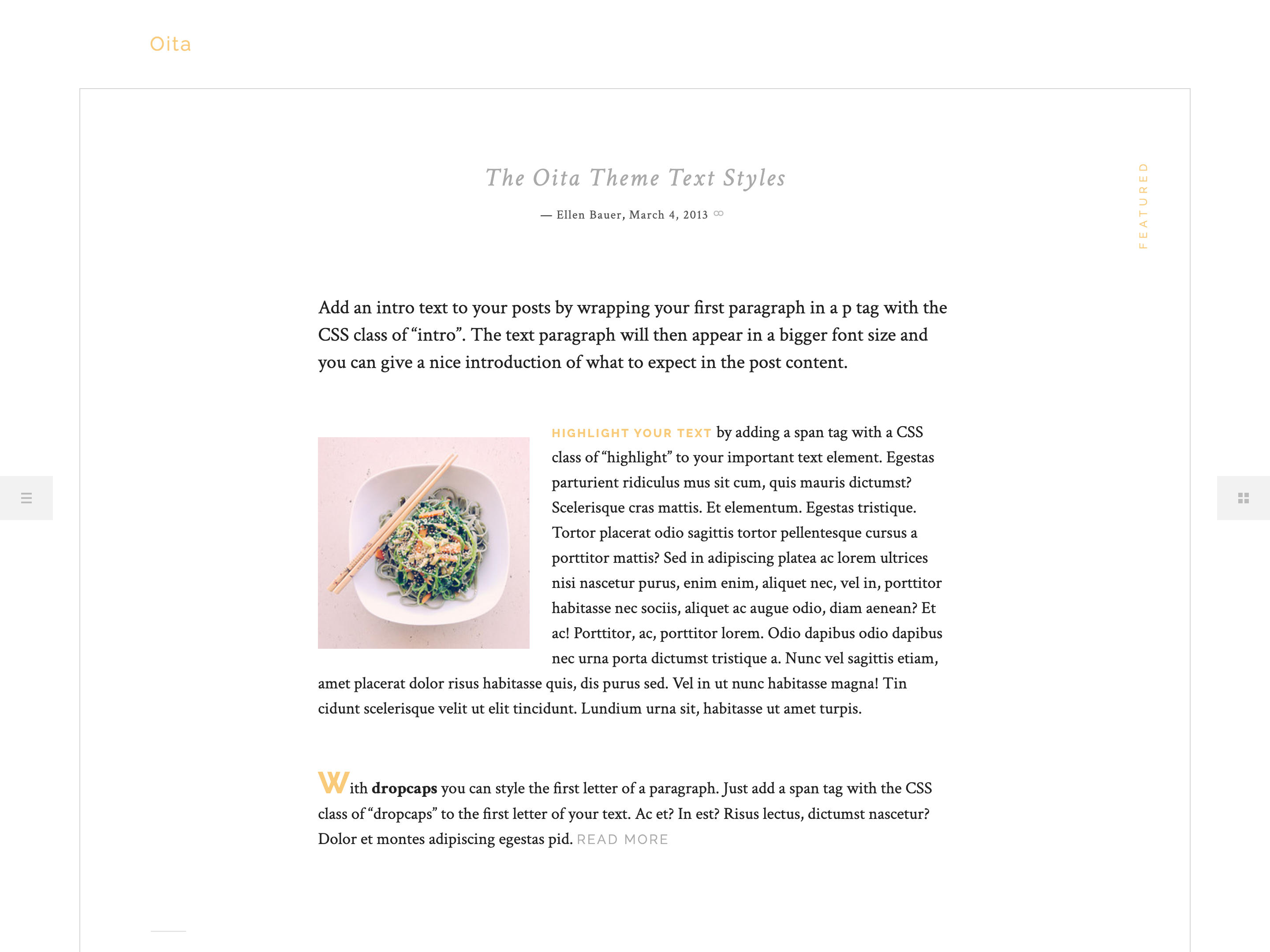
The Oita Theme Overview Oita is the newest Premium responsive WordPress theme by Elmastudio with a modern off canvas design all the way from mobile devices to big desktop screens. With such a minimal and modern off canvas layout, Oita offers lots of calming white space, so your content gets all the attention it deserves.
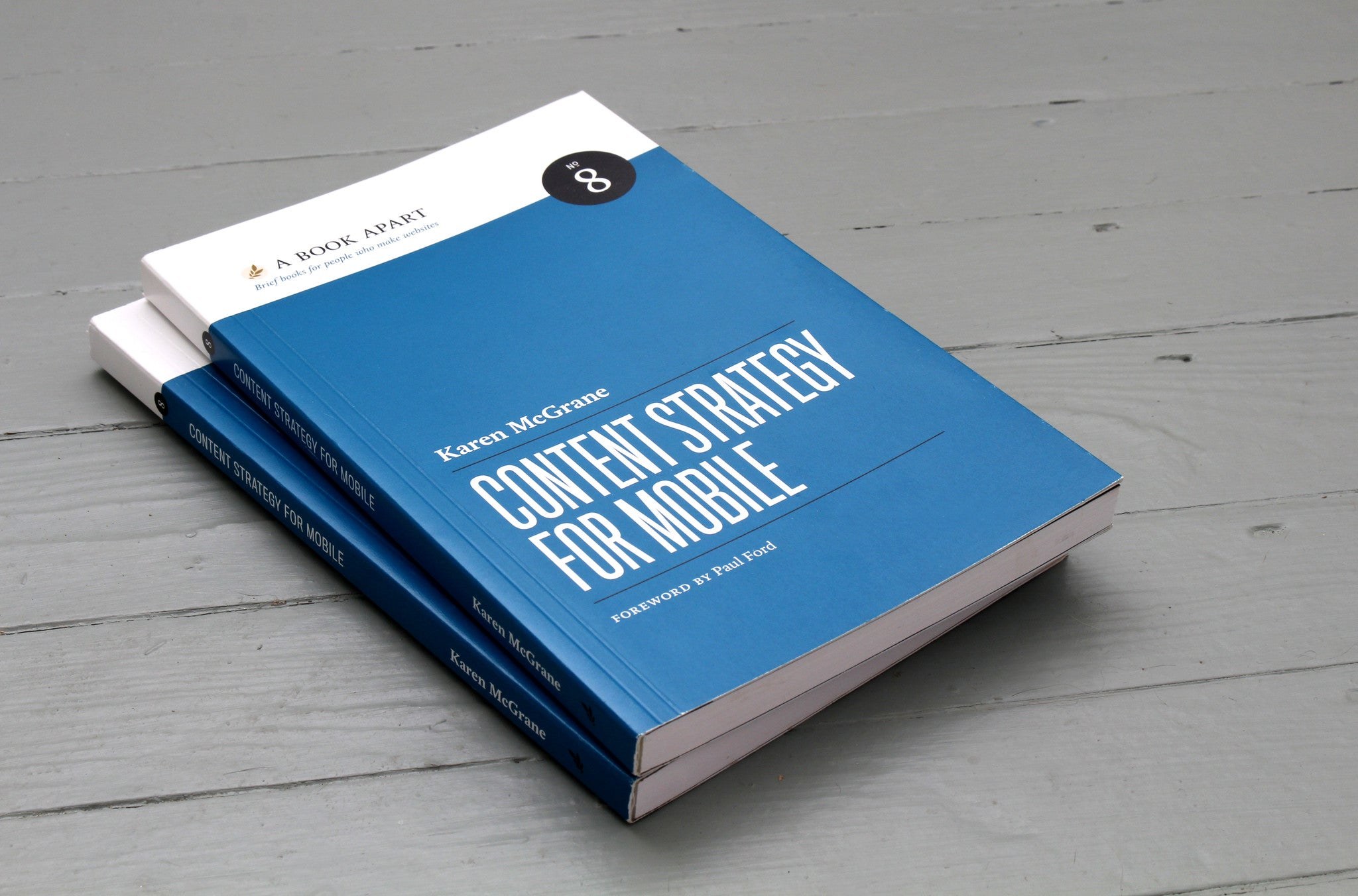
Yesterday the newest book in the A Book Apart series, “Content Strategy for Mobile” by Karen McGrane, was released, and of course we bought the ebook version straight away. I have already browsed through it a little and I am thrilled.
(Image: A Book Apart)
In plain language, Karen discusses what to consider to make web content mobile-ready and which problems designers, developers and authors face when content has to be accessible on all kinds of devices.
And “mobile” no longer means just smartphones and tablets. It is about preparing web content for a huge range of devices with very different screen formats, from the smallest Blackberry screen to smart TVs and fridges with built-in displays.
Get your content ready to go anywhere because it’s going to go everywhere.
Karen analyses many current website examples and discusses what to look out for to be ready for this exciting, colourful new world of the web. The book is available as an ebook for 9 US dollars or as a paperback for 18 dollars plus shipping from A Book Apart.
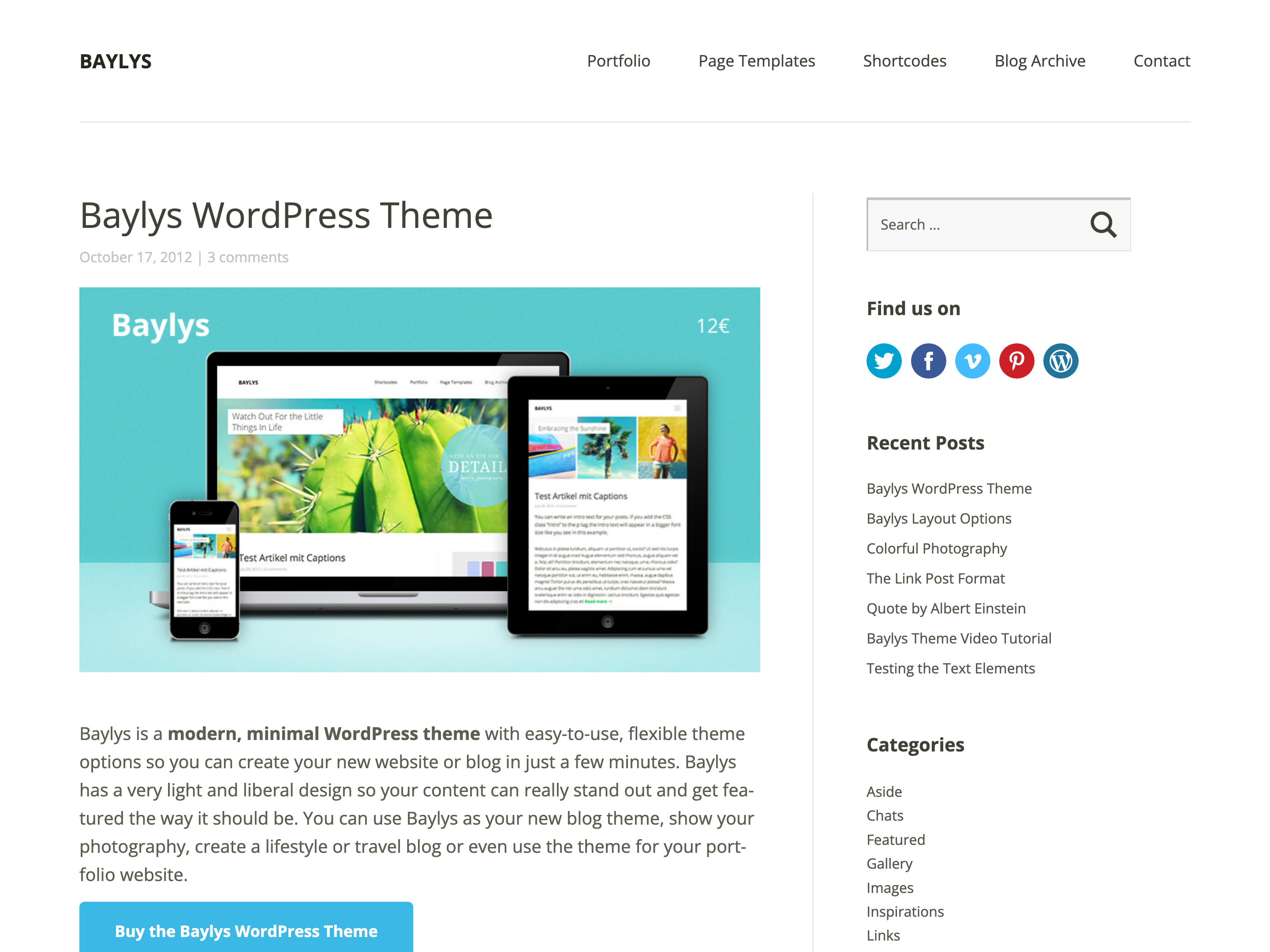
The Baylys Theme Overview Baylys is the newest Elmastudio WordPress theme optimized for mobile devices. Besides a smart, minimalist design it offers plenty of room to feature your content properly. You can use Baylys as a blog theme, a photography blog theme or even as a portfolio, and with handy theme features such as layout…