CSS Grid layouts are definitely one of the most exciting developments in CSS for years. It’s what all web designers and frontend developers have always dreamed of. Finally, we are able to convert our grid-based web designs directly into CSS without the help of javascript hacks or any kind of weird CSS technics. That sounds…
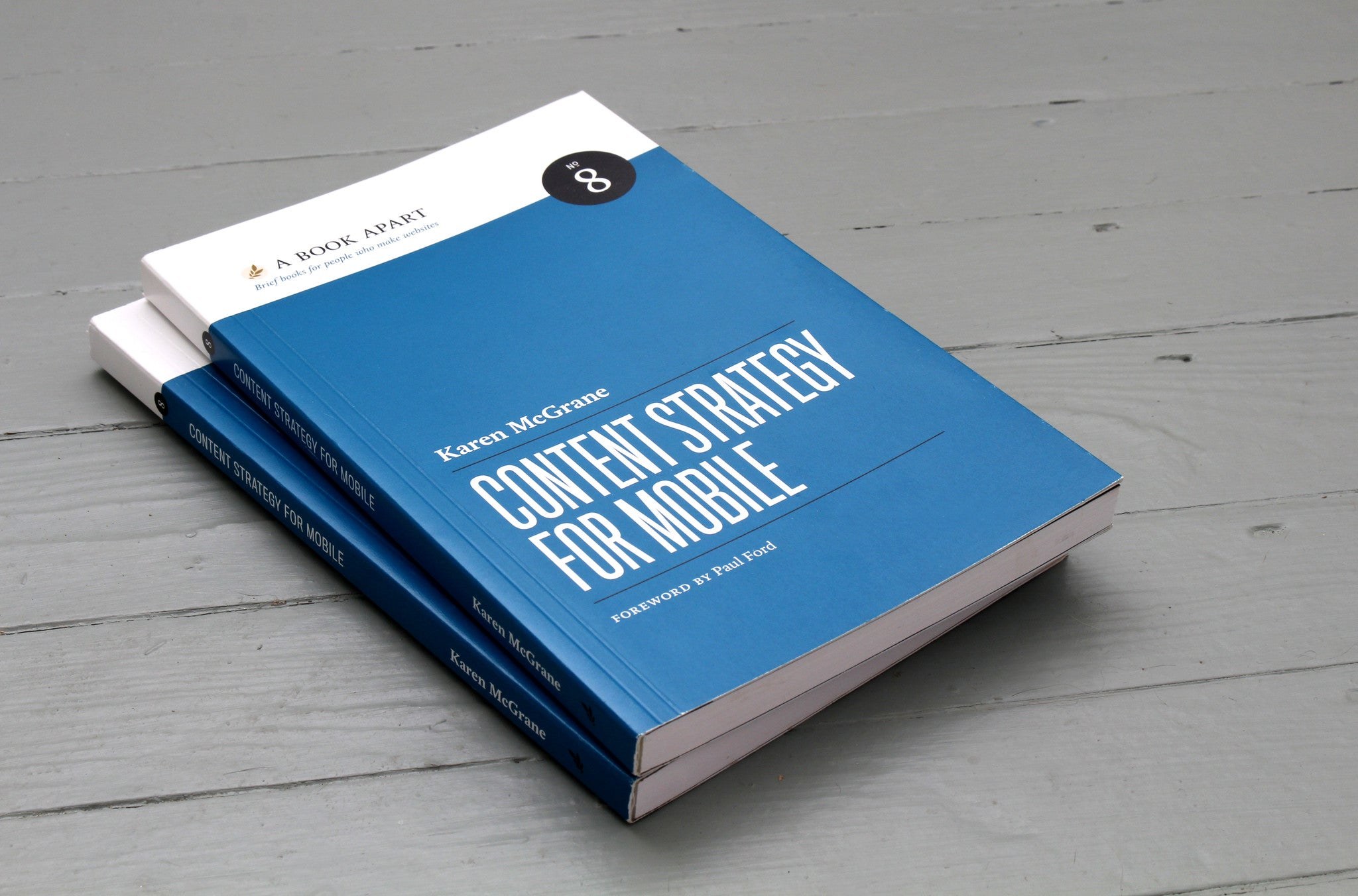
Yesterday the newest book in the A Book Apart series, “Content Strategy for Mobile” by Karen McGrane, was released, and of course we bought the ebook version straight away. I have already browsed through it a little and I am thrilled.
(Image: A Book Apart)
In plain language, Karen discusses what to consider to make web content mobile-ready and which problems designers, developers and authors face when content has to be accessible on all kinds of devices.
And “mobile” no longer means just smartphones and tablets. It is about preparing web content for a huge range of devices with very different screen formats, from the smallest Blackberry screen to smart TVs and fridges with built-in displays.
Get your content ready to go anywhere because it’s going to go everywhere.
Karen analyses many current website examples and discusses what to look out for to be ready for this exciting, colourful new world of the web. The book is available as an ebook for 9 US dollars or as a paperback for 18 dollars plus shipping from A Book Apart.
Thinking mobile first forces you to only keep what matters in our sites. We have to think about usability & content because people on mobile have very little time and screen space.
The line is from Luke Wroblewski’s notes on Jeffrey Zeldman’s “Content First” talk at An Event Apart in 2012. We were building our first mobile-first themes at the time, and the sentence put into words why: the layout doesn’t get smaller, the content gets more important.
On Luke W’s blog you can download a helpful overview of the common touch gestures on mobile devices (Touch Gesture Cards). The overview comes as handy graphics with short descriptions, and you can even print the gestures as individual cards. The standard gestures such as tap (a light touch with the fingertip) or swipe/flick (a quick stroke across the screen, for scrolling or paging) are explained, but so are more elaborate ones like rotate, scale, or closing elements with a finger movement, which often takes a sequence of moves.
The cards make it easy to get familiar with the gestures touchscreens support. Colour coding sorts them into basic, core, navigation, drawing, object-related, Apple iOS, Android and Windows Phone 7 gestures.
Even though not every touch gesture is supported equally in all mobile browsers yet, I think it makes sense to get to know the common ones now. Effects like swipe are already used in image sliders (see PhotoSwipe or RoyalSlider).
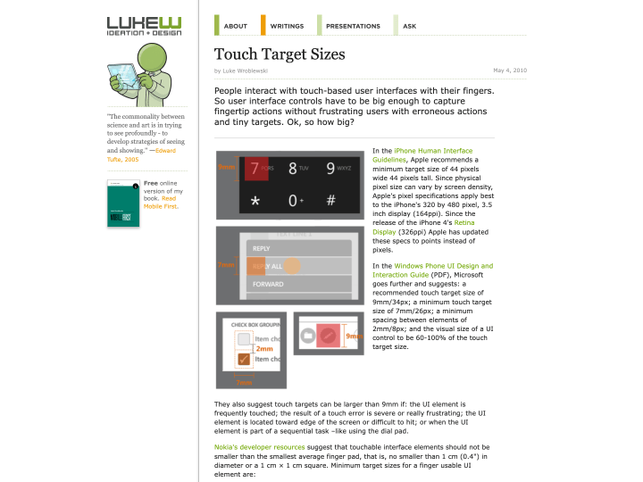
Luke W’s article “Touch Target Sizes” gives helpful guidelines for designing touchscreen buttons. The button sizes listed there were collected from several sources, such as the iPhone Human Interface Guidelines, all linked from the article.
The guidelines and tips are really useful, for example when you work on a responsive web design. Designing buttons for a finger is a different task from designing buttons for a mouse.
Button sizes have to match the size of a fingertip, and the spacing between buttons should be generous so that nobody taps the wrong one by accident. Apple’s figure for a standard touchscreen button is 44 by 44 points. That seems very large at first, but one trick is to make only the tappable area that size and draw the visible button smaller.
Our Newsletter
On its way
Join 4,700+ readers. No spam, unsubscribe anytime.