
Am I Responsive?

·
Am I Responsive?fireship.dev

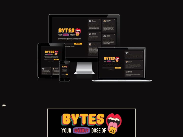
After I read the newest Responsive Design Newsletter by @justinavery this morning I had a little “aha moment”, because I never heard of his awesome side project Am I Responsive? until today. The screenshot tool lets you create helpful screenshot of your responsive website with just one click and it’s also a lot of fun to see your responsive webdesign appear in such a beautiful presentation.

Elmastudio.de on Am I Responsive?.

The tool will show your responsive website in a desktop (1600x992px resolution), laptop (1280x802px), tablet (768x1024px) and mobile phone (320x480px) screen and you can even rearrange your setup by draging’n’droping the devices on the screen.

So “Am I Responsive?” is definitely bookmarked, since I think the tool is a beautiful way to create fast responsive website presentation screenshots and to get a first idea how your responsive web design will look on different devices.

Categories: ,

Enjoy what we do here? Then subscribe to our newsletter or YouTube channel. It costs you nothing and already helps a lot. If you'd like to go one step further, leave a small thank-you below. It keeps Elmastudio free for everyone, and we'll keep writing, as we have since 2009. Thank you.Enjoy what we do here? Then subscribe to our YouTube channel. It costs you nothing and already helps a lot. If you'd like to go one step further, leave a small thank-you below. It keeps Elmastudio free for everyone, and we'll keep writing, as we have since 2009. Thank you.

One comment

  1. Hi Ellen,
    this is really great! I’ve been waiting for an app like AM I RESPONSIVE,
    Regards
    Annett

Leave a Reply

Your email address will not be published. Required fields are marked *

Expand sidebarB
DEEN