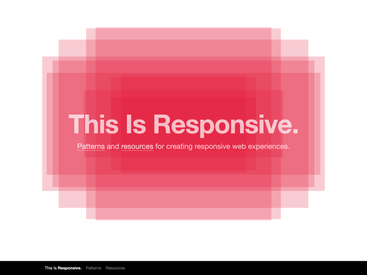
Brad Frost has put together “This Is Responsive”, a new and extensive site with tips, resources and code snippets for responsive web design.
Responsive Web Design
6 posts
-
-
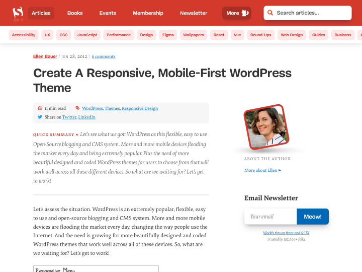
Create a Responsive, Mobile-First WordPress Theme
-
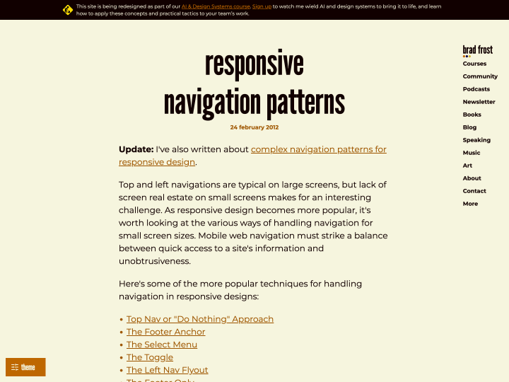
Responsive Navigation Patterns
-
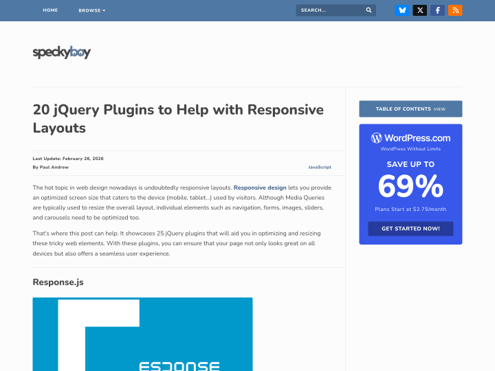
25 jQuery Plugins for Responsive Layouts
The article “25 jQuery Plugins to Help with Responsive Layouts” on the Speckyboy blog is a useful collection of jQuery plugins that can be used when working on a responsive web design. We have presented one or two of them here on the blog already, but the article still gives a good overview of current plugin solutions.
-
Elastislide
The image carousel plugin Elastislide is another helpful jQuery plugin for making responsive web designs more interesting and versatile. With the carousel slider you can show a series of images, say your latest portfolio pieces or your last holiday photos. Alongside the plugin description there is a nice live demo page with several examples of the carousel in use.
-
Simple Media Queries Tester
The online tool “Simple Media Queries Tester” lets you test your website quickly, and above all clearly, in three different screen widths at once. You can set the widths yourself, for example 320 pixels for the iPhone in portrait or 758 pixels for the iPad in portrait. I find it really practical for checking a responsive design at a glance.