
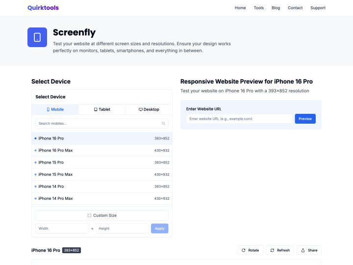
Screenfly is another nice online tool for quickly testing the responsive design of a website in different screen resolutions. Once your work is online on a test domain, it helps you spot mistakes in the styles of your CSS3 media queries fast.
Online Tools
2 posts
-
-
Simple Media Queries Tester
The online tool “Simple Media Queries Tester” lets you test your website quickly, and above all clearly, in three different screen widths at once. You can set the widths yourself, for example 320 pixels for the iPhone in portrait or 758 pixels for the iPad in portrait. I find it really practical for checking a responsive design at a glance.
