Of course there are a quite a number of great icon fonts out there, like the Font Awesome icon font, which is especially designed to work with Bootstrap. For our next WordPress theme though, we dicided to use the Genericons Icon Font. With Genericons you don’t get that many icons to choose from, but in…
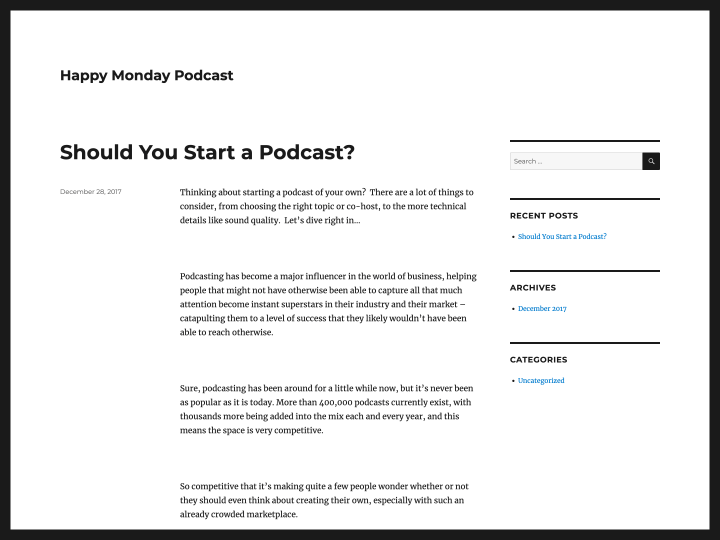
For all you web design fans, who also have trouble getting into the flow of things on mondays, the two web design insiders Sarah Parmenter (@sazzy) and Josh Long (@joshlong) have created the Happy Monday podcast series a while back.
By now there are more than 20 podcasts available to listen to online or download as MP3. Podcast guests are international webdesign and creative pleople like Jason Santa Maria, Trent Walton or Jessica Hische. It’s definitely worth it to listen to the podcasts and make your start into the new week just a little bit sweeter.
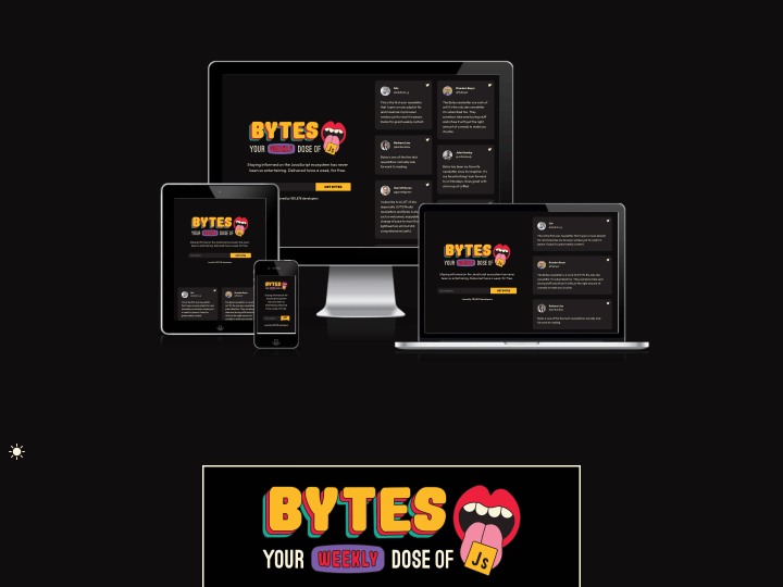
After I read the newest Responsive Design Newsletter by @justinavery this morning I had a little “aha moment”, because I never heard of his awesome side project Am I Responsive? until today. The screenshot tool lets you create helpful screenshot of your responsive website with just one click and it’s also a lot of fun to see your responsive webdesign appear in such a beautiful presentation.
The tool will show your responsive website in a desktop (1600x992px resolution), laptop (1280x802px), tablet (768x1024px) and mobile phone (320x480px) screen and you can even rearrange your setup by draging’n’droping the devices on the screen.
So “Am I Responsive?” is definitely bookmarked, since I think the tool is a beautiful way to create fast responsive website presentation screenshots and to get a first idea how your responsive web design will look on different devices.
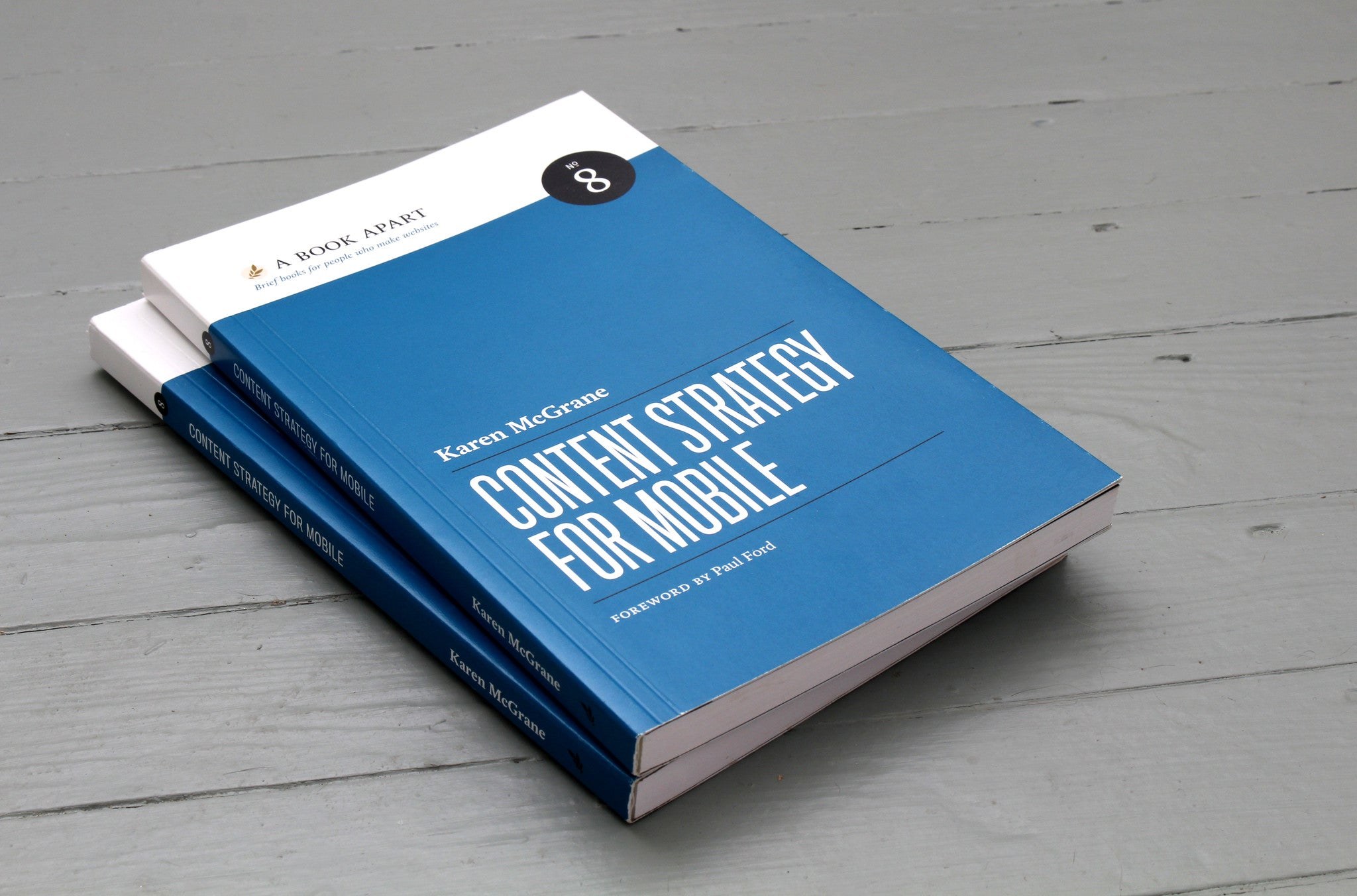
Yesterday the newest book in the A Book Apart series, “Content Strategy for Mobile” by Karen McGrane, was released, and of course we bought the ebook version straight away. I have already browsed through it a little and I am thrilled.
(Image: A Book Apart)
In plain language, Karen discusses what to consider to make web content mobile-ready and which problems designers, developers and authors face when content has to be accessible on all kinds of devices.
And “mobile” no longer means just smartphones and tablets. It is about preparing web content for a huge range of devices with very different screen formats, from the smallest Blackberry screen to smart TVs and fridges with built-in displays.
Get your content ready to go anywhere because it’s going to go everywhere.
Karen analyses many current website examples and discusses what to look out for to be ready for this exciting, colourful new world of the web. The book is available as an ebook for 9 US dollars or as a paperback for 18 dollars plus shipping from A Book Apart.
Thinking mobile first forces you to only keep what matters in our sites. We have to think about usability & content because people on mobile have very little time and screen space.
The line is from Luke Wroblewski’s notes on Jeffrey Zeldman’s “Content First” talk at An Event Apart in 2012. We were building our first mobile-first themes at the time, and the sentence put into words why: the layout doesn’t get smaller, the content gets more important.