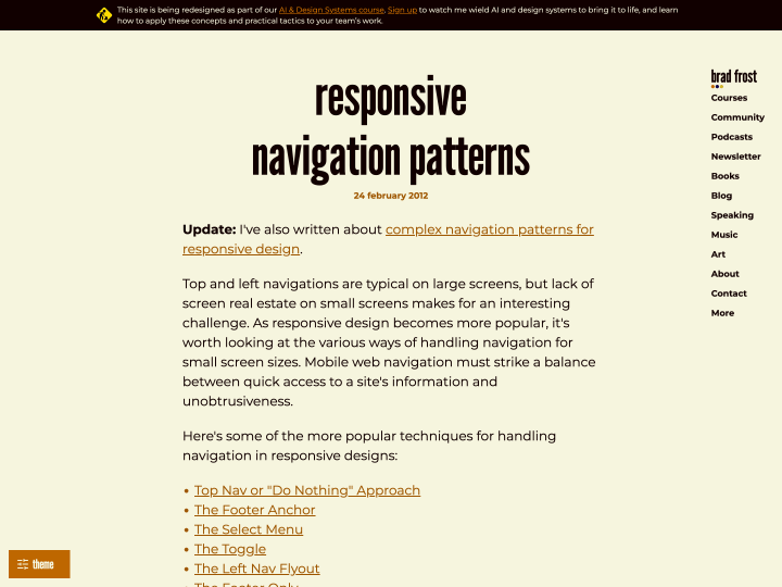
In this article Brad Frost gives a helpful overview of different approaches to responsive web design menus. For each solution he weighs the pros and cons and points to examples on the web. Well worth reading for every responsive web design fan!
Responsive Web Design
9 posts
-
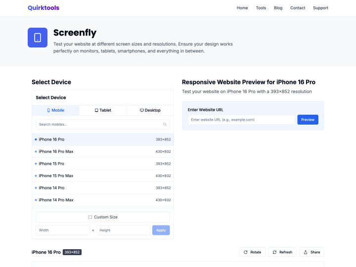
Screenfly
-
Simple Media Queries Tester
The online tool “Simple Media Queries Tester” lets you test your website quickly, and above all clearly, in three different screen widths at once. You can set the widths yourself, for example 320 pixels for the iPhone in portrait or 758 pixels for the iPad in portrait. I find it really practical for checking a responsive design at a glance.