About three months ago I switched from using Coda2 as my text editor to the open source editor Atom. I used Coda for several years and I was honestly a bit stuck in it. What I mean by that is that I used Coda every day, but without really optimizing my workflow any more. Since…
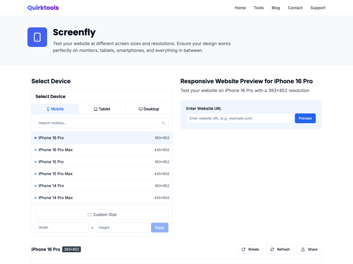
Screenfly is another nice online tool for quickly testing the responsive design of a website in different screen resolutions. Once your work is online on a test domain, it helps you spot mistakes in the styles of your CSS3 media queries fast.
The online tool “Simple Media Queries Tester” lets you test your website quickly, and above all clearly, in three different screen widths at once. You can set the widths yourself, for example 320 pixels for the iPhone in portrait or 758 pixels for the iPad in portrait. I find it really practical for checking a responsive design at a glance.