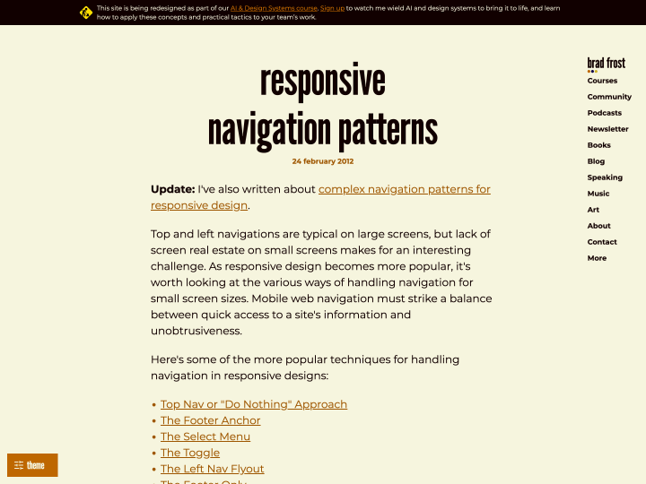
In this article Brad Frost gives a helpful overview of different approaches to responsive web design menus. For each solution he weighs the pros and cons and points to examples on the web. Well worth reading for every responsive web design fan!
Responsive Web Design
11 posts
-
Touch Gesture Cards
On Luke W’s blog you can download a helpful overview of the common touch gestures on mobile devices (Touch Gesture Cards). The overview comes as handy graphics with short descriptions, and you can even print the gestures as individual cards. The standard gestures such as tap (a light touch with the fingertip) or swipe/flick (a quick stroke across the screen, for scrolling or paging) are explained, but so are more elaborate ones like rotate, scale, or closing elements with a finger movement, which often takes a sequence of moves.
The cards make it easy to get familiar with the gestures touchscreens support. Colour coding sorts them into basic, core, navigation, drawing, object-related, Apple iOS, Android and Windows Phone 7 gestures.
Even though not every touch gesture is supported equally in all mobile browsers yet, I think it makes sense to get to know the common ones now. Effects like swipe are already used in image sliders (see PhotoSwipe or RoyalSlider).
-
Touch Target Sizes

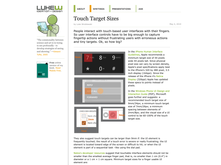
Luke W’s article “Touch Target Sizes” gives helpful guidelines for designing touchscreen buttons. The button sizes listed there were collected from several sources, such as the iPhone Human Interface Guidelines, all linked from the article.
The guidelines and tips are really useful, for example when you work on a responsive web design. Designing buttons for a finger is a different task from designing buttons for a mouse.
Button sizes have to match the size of a fingertip, and the spacing between buttons should be generous so that nobody taps the wrong one by accident. Apple’s figure for a standard touchscreen button is 44 by 44 points. That seems very large at first, but one trick is to make only the tappable area that size and draw the visible button smaller.
-
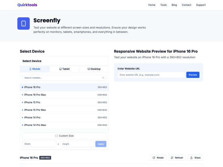
Screenfly
-
Simple Media Queries Tester
The online tool “Simple Media Queries Tester” lets you test your website quickly, and above all clearly, in three different screen widths at once. You can set the widths yourself, for example 320 pixels for the iPhone in portrait or 758 pixels for the iPad in portrait. I find it really practical for checking a responsive design at a glance.